Introduction
The design of the label has an important impact on the way a product is perceived and viewed, particularly in the realm of mineral water, in which security, purity, and trust are vital. In a market that is crowded with identical bottles, the label appearance is often the most important aspect for customers. Prior to reading the product’s information or tasting the beverage, customers subconsciously assess the quality of the product based on the design of its label.
The modern mineral water label design is not just decorative anymore. It is a reflection of lifestyle as well as brand values and the expectations of consumers. The design aesthetics are evolving as brands embrace clearer, more profound, and more conscious label designs that are more to the heart while also maintaining a sense of clarity and professionalism.
Understanding Label Design in Mineral Water Packaging
The design of the label is a visual and informative layer that conveys the brand’s image directly onto the packaging. When packaging for mineral water, the label should appear simple, straightforward, and simple to comprehend. Customers expect transparency, and the design for the bottle should reflect this by using sensible layouts, easy-to-read typefaces, and intelligent color choices.
The design of the label is subtle and creates trust and assures consumers regarding the purity of the liquid inside the bottle.
What is the importance of label design for mineral water brands?
The design of labels is among the best tools used to alter perceptions in the industry of mineral water. While water is an essential element, people tend to associate style in relation to product quality. The right label design can make a product an established and trusted name.
Label design is one of the reasons that are important:
- It gives a solid initial impression when you walk into a store
- It helps build trust and establish credibility immediately.
- It conveys freshness and purity visually
- It helps build brand loyalty over time.
These elements directly affect the buying decision of customers and their loyalty to them.
The Core Element from Mineral Water Label Design
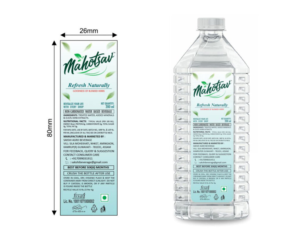
Each mineral water label is a blend of informational and visual elements. They must function in harmony to minimize clutter but still convey the essential information. Logos and brand names typically take first place and are accompanied by clear product details.
Common elements on mineral water labels:
- Placement of logo and brand name
- Mineral and water source information
- Details about manufacturing and expiry dates
- The company’s name and information on regulatory agencies
If these elements are placed to be balanced and clear and the label appears reliable and professional.
Modern Label Design with Minimalists in Modern Label Design
The minimalistic design has been one of the top fashions for label designs of mineral water. People are more likely to associate simplistic design with honesty and purity. Simple labels employ fewer visual elements, soft colors, and the use of ample spacing for a serene and elegant design.
This strategy is especially effective in the case of mineral water, as it visually supports the purity and transparency of the product. Through avoiding excessive images and excessive decoration, the minimalist design of labels allows the actual product to take place in the spotlight.
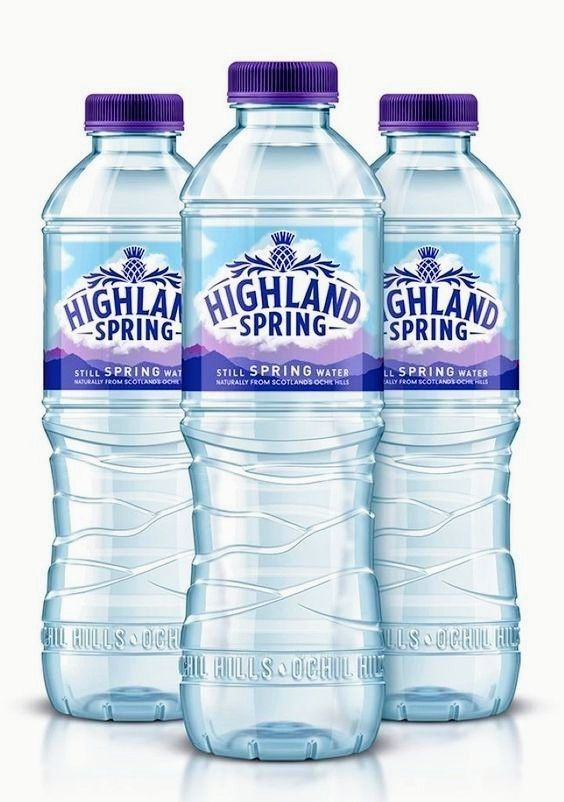
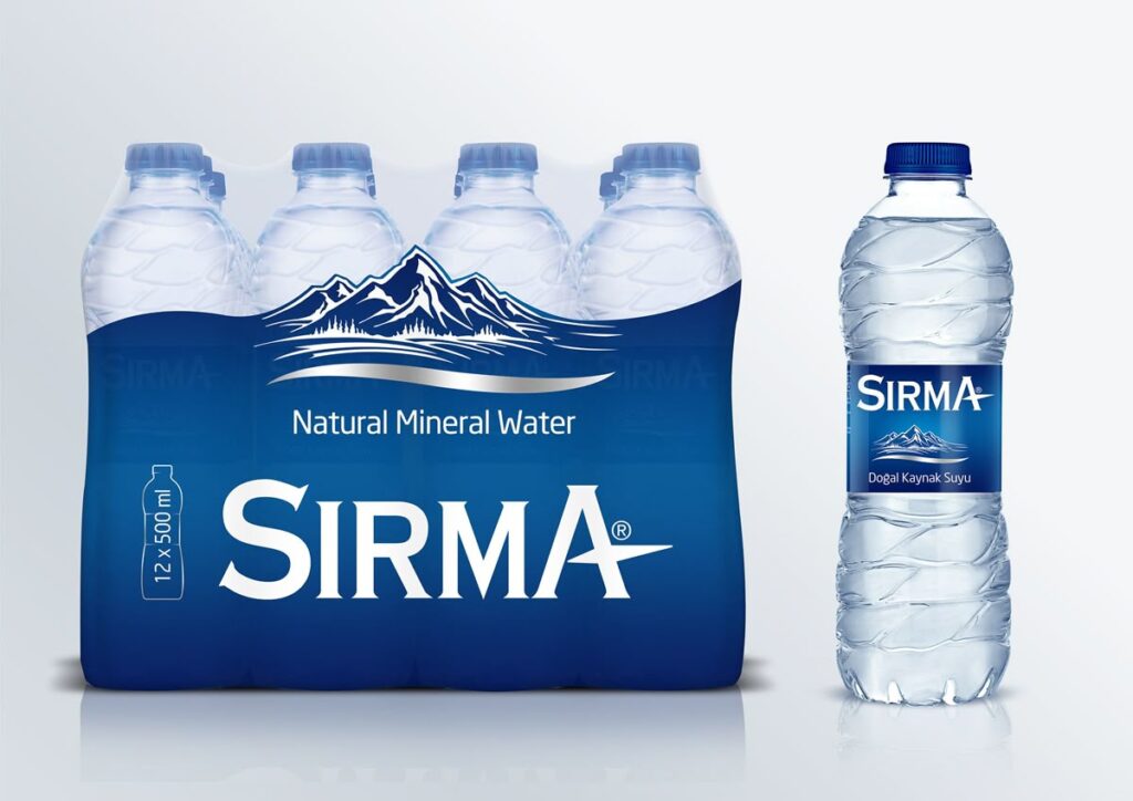
The design of the mineral water labels is inspired by nature. New Trends
Designing labels inspired by nature remains the most popular design for mineral water companies. Images that reference natural elements allow consumers to instantly associate the water brand with the source. They can be calming and genuine, which reinforces the notion of pure and natural water.
Common sources of inspiration utilized in label design based on nature:
- Mountains, springs and rivers
- The leaves, the plants and other natural textures
- Natural and earthy tones
- Graphic elements that flow softly and fluidly
This style of design strengthens emotional connections and increases confidence in the product’s authenticity.
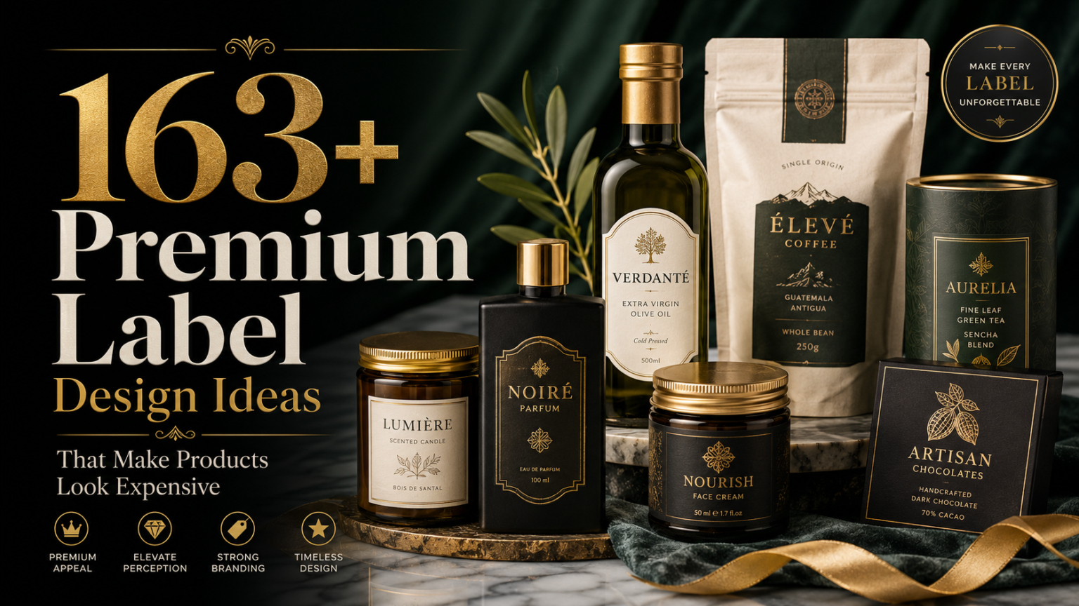
Premium and Elegant Mineral Water Label Style
Since mineral water is becoming more of a lifestyle item and not just an essential item, many companies are adopting luxury and premium designs for their labels. The designs are focused on the beauty, sophistication, and exclusivity. Fine detailing and top-quality materials enhance the overall appearance while not overpowering the overall design.
The design of luxury mineral water labels is often seen in hotels and fine dining establishments’ corporate gifts as well as in premium retail settings in which visual elegance plays key roles in the brand’s perception.
Sustainable Thinking in Label Design
Sustainability has been a key impact on contemporary labels. The public expects brands to be environmentally responsible not just by a message, but also via the design decisions. Designing water bottles for mineral water responds with simpler images with natural colors, as well as mindful use of material.
What sustainability measures are reflected in the design for labels?
- Minimal ink consumption and reduced graphics
- Color palettes that are muted and natural
- Clear layouts, which avoid excessive printing
- The messages convey responsibility in a subtle way.
This method communicates respect and responsibility with minimal visual clutter.
A transparent and clean label design Aesthetics
Labels that are transparent and clear have gained popularity for the packaging of mineral water bottles. The ability to allow the water in the bottle to be visible enhances the impression of authenticity and pureness. They often use graphic design rather than heavy fonts to create a sleek and attractive appearance.
The transparent design of the label is in line with the expectations of consumers for transparency, ease of use, and genuineness.
The use of typography as a design statement
Typography has emerged as a potent feature in the design of mineral water labels. Instead of elaborate illustration, most brands use distinctive and powerful typography to make an impression. Typography conveys character, no matter if your brand is trying to appear trendy, luxurious, or approachable.
The clear typography ensures that the text is read across various sizes of bottles and enhances visibility on shelves.
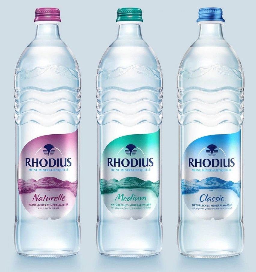
Colour Choices and the Emotional Impact
The color of the bottle plays an insignificant but significant part when it comes to mineral water label designs. Soft blues are often associated with the freshness and trust of a brand, whereas greens symbolize healthy and natural. White spaces promote cleanliness, as darker colors are often employed to signal superior positioning.
Colors that are thoughtfully chosen help create an emotion and strengthen the branding image.
Layout and Balance of Visuals in the Design of Labels
The design of the label for mineral water affects the ease with which information is easily understood. An organized layout directs the eye of the reader smoothly from the brand’s name and other information to the supporting elements. Proper spacing and alignment give the impression of professionalism and order.
Modern labels favor the clarity, structure, and harmony in the visual.
The Finishing Touches that Enhance Label Design
Printing finishes give the character and depth of mineral water labeling. Matte finishes provide a smooth and luxurious feel, while glossy ones enhance the vibrancy of colors. The subtle embossing and texture of the finish can improve the feel of the material by using it in a thoughtful manner.
Conclusion
Designing labels is an important component of the mineral water brand. It is the first impression that people get that establishes trust and affects buying decisions. When mineral water label style trends change, brands that focus on clarity, transparency, and simplicity will be able to distinguish themselves in a highly competitive marketplace.
A properly designed label can do more than simply decorate a bottle. It communicates values, inspires trust, and can transform the basic bottle into an unforgettable brand experience.