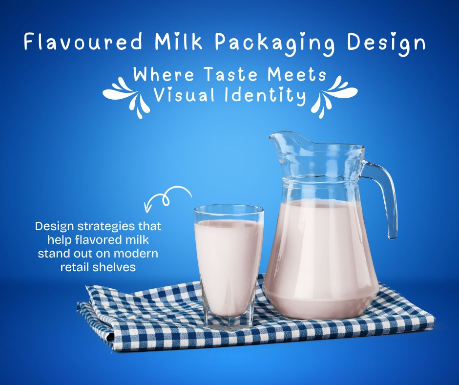
The taste of milk has shifted from its original image of an adult beverage. It is now marketed as a nutritious, convenient drink that is enjoyable for all kinds of people such as teens, young professionals, people who exercise, as well as families. With changing consumer preferences and competition rises increasing the importance of design for packaging has risen dramatically. For many, the packaging is the first contact that a consumer has with the brand of flavoured milk and is a crucial aspect in shaping perceptions as well as purchasing choices.
Flavoured milk packaging does not just focus on appearance. It’s an effective device that conveys flavour and quality, as well as safety and the personality of the brand in just a couple of moments. In a market crowded of soft drinks, juices as well as functional drinks the milk that is flavoured must define what is unique about it. Design elements like the use of color, typography and imagery as well as structure are used to convey a message that is resonant with the intended customers.
Brands need to ensure that their packaging design can create recognition confidence, trust, and an emotional feeling of. It allows consumers to recognize their favourite flavours quickly as well as understand the benefits of the product and be confident about the choice they make. If the company aims to be a fun, high-end healthy, modern, or trendy packaging design can be the language of visuals through the way that this identity is communicated. When it comes to the milk with flavour that taste can’t be tasted prior to purchase, the style is more important than any words.
Understanding the Flavoured Milk Market
The milk with flavour is in a distinct position between indulgence and health. People see it as an alternative to carbonated sodas that are sugary however they still want satisfaction and enjoyment. This perception is directly influenced by the design of packaging. The packaging must convey nutrition credibility, without making their product appear bland or unnatural.
Designing packaging for this type of category should reflect the changing lifestyles of consumers that include on-the-go shopping and a greater awareness of health. An understanding of the market can help designers pick the best tone, style as well as visual clues. If the packaging matches how people perceive flavoured milk it enhances the brand’s relevancy and popularity.
The Importance of First Impressions in Packaging
When shopping in retail, shoppers tend to make choices in a matter of moments. The packaging of milk that is flavoured should grab attention right away yet remain easy and accessible. An initial impression of quality is the deciding factor in whether a brand is admired or not.
Visual hierarchy plays a crucial part in helping the user’s attention. Brand name, taste as well as the key features are required to be easily evident. Clear layouts, a well-balanced spacing and mindful design can help avoid visual confusion. If the first impression is secure and committed, buyers will be more inclined to believe in the item within.
Color Psychology and the packaging of flavoured milk
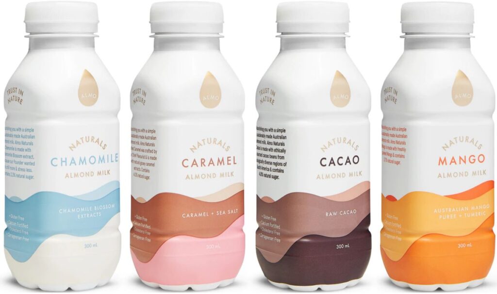
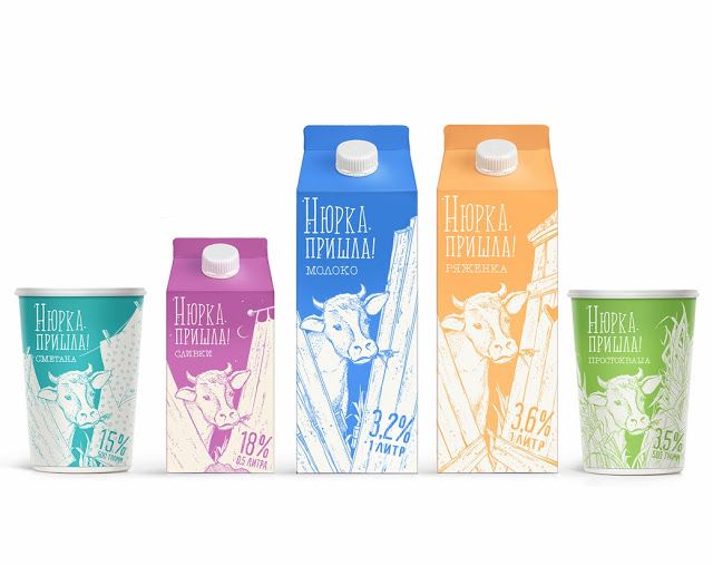
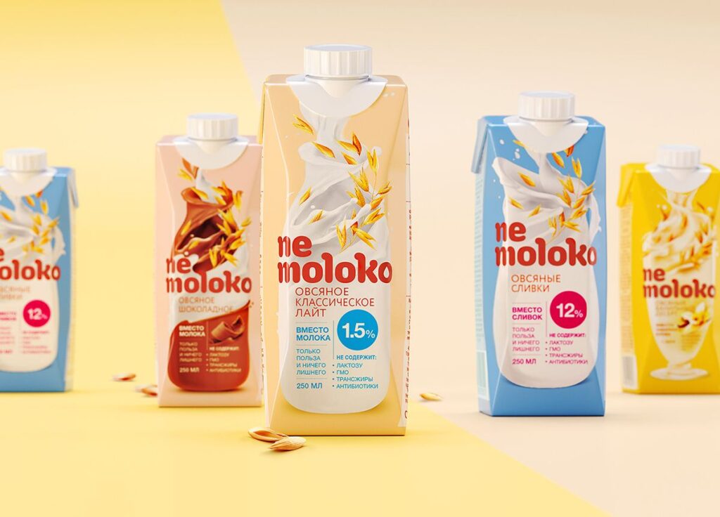
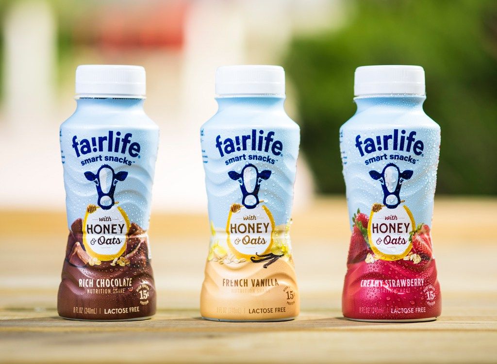
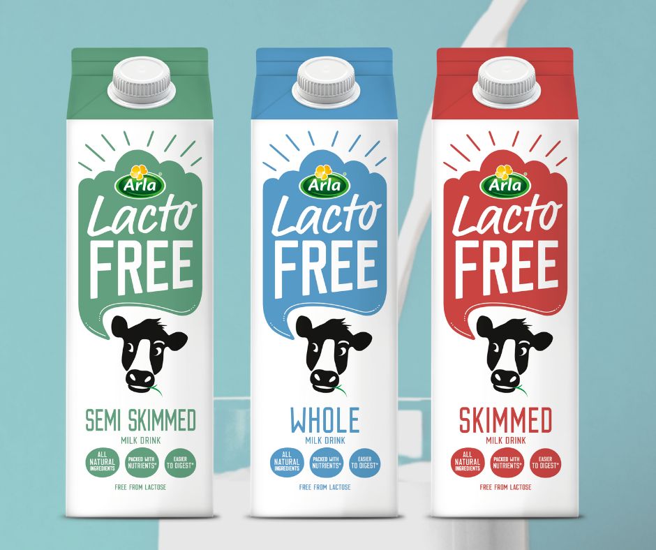
Color is among the most potent tools for the design of milk products with flavor. It aids consumers in identifying the flavours in a short time and makes emotions through flavor and mood. Chocolate flavourings typically employ deep brown hues that suggest richness when fruit-based flavors depend in vibrant hues that convey the freshness and joy.
Beyond flavor recognition the color of a brand also defines its character. Colors that are vibrant and lively feel young, whereas softer or neutral shades convey sophistication and healthy. The consistent use of colors across variations increases recognition and enhances visibility on the shelves, making it easier to identify the brand as time passes.

Types of Packaging and the Readability of their Designs
The way a typeface is used affects the way a flavored milk company is perceived. Fonts that are rounded and friendly tend to be fun and easy to use and clean, modern fonts convey trust and high-quality. Typography selection should be in line with the brand’s intended market and position.
It is also important to readability. Packaging can be seen from afar or while moving, and therefore the text should be easily read and understandable. A proper font hierarchy will ensure that the most important details stand out and does not overwhelm the overall design. A well-thought out typography improves the clarity of your brand and strengthens its identity.
Graphic Style and Visual Elements
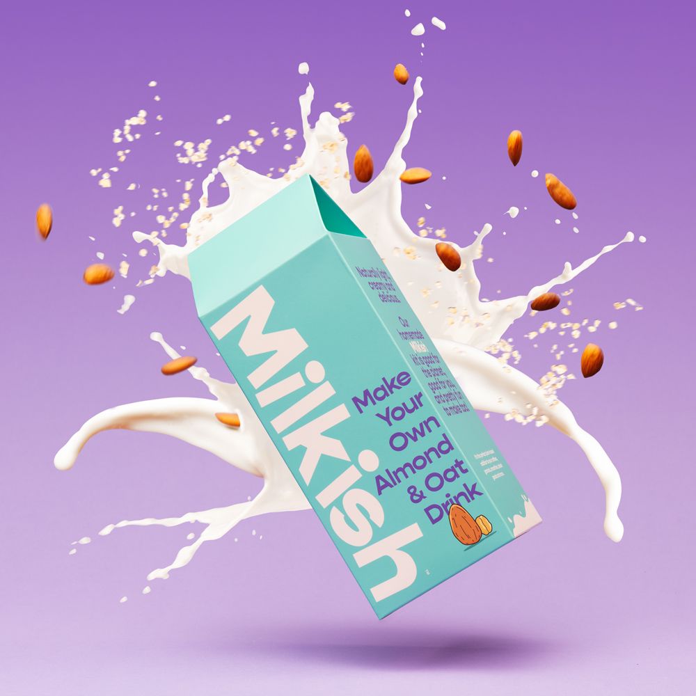
Illustrations, graphic designs and images bring the flavour of packaging for milk to life. Certain brands employ realistic ingredient illustrations to emphasise authenticity and others use illustrations or abstract styles to convey emotion. Each approach can work in conjunction with a brand’s narrative.
The visual elements must complement the overall look instead of competing to draw attention. The consistency of style across versions helps keep brand name recognition. If visuals are intentional and consistent, the packaging appears better-designed and recognizable to the consumer.
Package Structure, Format and Packaging Selections
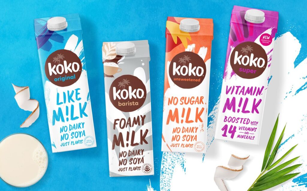
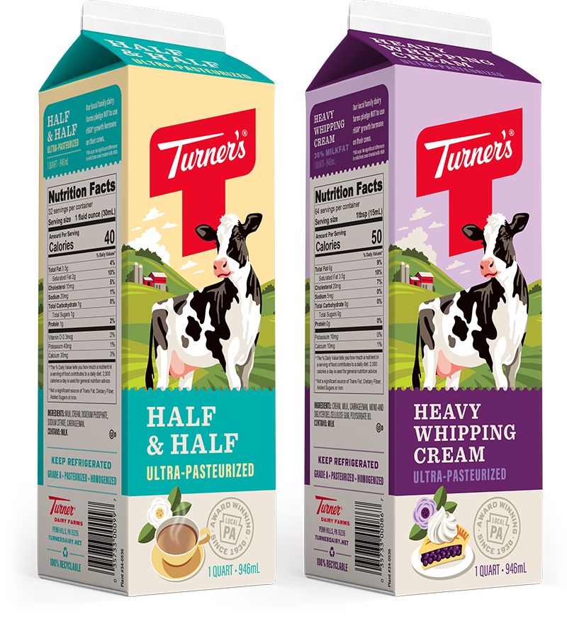
The shape and form of milk bottles with flavours influences the perception of usability and also its accessibility. Cartons usually convey warmth and confidence, while bottles are luxurious and comfortable for consumption on-the-go. The cans and the bottles provide a fun and modern design, based on the design and execution.
Design should take into consideration how the product feels when on the hand the way it sits on the shelves, and also how quickly it will be used. An attractively designed structure improves the users’ experience, while also supporting the visual brand identity of the company. Function and form must go well.
The balance between trust and fun in the dairy packaging
The design of the packaging for flavoured milk must find a compromise between pleasure and authenticity. Since it is a dairy product it needs to reassure the consumer regarding hygiene, safety and the quality. In addition it needs to be fun as well as delicious and inviting.
Clear layouts, clean labels, and professional finishing can help build confidence. Colors that are vibrant, flavor cues and captivating visuals create the sense of excitement. If these components are paired appropriately, packaging appeals the senses without diminishing confidence in the quality of the product.
Consistency across Flavours and Variants
Many flavoured milk brands provide various flavors. This makes uniformity a crucial design hurdle. The packaging should be clear about the different flavours while retaining a consistent branding strategy. The result is that consumers can to recognize the brand immediately regardless of flavor.
A consistent layout, typography, and the placement of logos create a sense of familiarity while color and visual variants differentiate distinct flavors. The strong design process can allow brands to broaden their offerings without losing their clarity or impact, thereby increasing brand loyalty over the long term.
Common Design and Packaging Mistakes to avoid
The overcrowding of packaging that has too much detail is a typical oversight in milk designs with flavours. A lot of text, multiple designs, and conflicting fonts could confuse customers and reduce the impact of shelves. A different issue is the lack of differentiated flavors that slow the process of making a decision.
A lack of consistency in branding across different variants or formats may weaken branding identities. The most effective packaging design emphasizes simplicity, control and coherence. By avoiding these mistakes, you can to ensure that the product is communicated confidently and effectively.
Summary
Flavored milk packaging designs play crucial roles in how the product is viewed, interpreted and remembers. In the midst of a crowded beverage market packaging is the main way for brands to communicate taste, quality, and the brand’s identity. From typography and color psychology to visual storytelling and structure every design element influences consumers’ behaviour.
A successful packaging design balances many expectations all at the same time. It should be enjoyable but reliable, contemporary yet familiar, distinct yet consistent. If design and style are in sync with the consumer’s expectations and values of the brand and values, it provides an effortless experience which goes far beyond the aesthetics. Packaging is now an investment in strategic value and not just a cosmetic layer.
While flavoured milk continues grow as a product manufacturers who put their money into thoughtful, well-crafted packaging designs gain an important benefit. Visually clear systems, solid brand image, and an emotions help make products be noticed on shelves and also in the consumers’ minds. The bottom line is that great packaging doesn’t just sell drinks, it creates an image.
We at Comma Design, we view packaging as a dialogue between the brand and its customer. If the conversation is engaging, clear, and genuine, it can create lasting branding relationships.