Introduction
A logo is among the fundamental components of branding’s identity. It serves not just as an indicator of identity but also as a concise image of the company’s goals, purpose, mission, and identity. In this regard, a successful logo design demands more than just aesthetic appeal. It requires the ability to think strategically, conceptual clarity, and a grasp of the principles behind visual communication.
Professionally Logos have to function in different contexts, including digital, print, motion, and environmental—while still remaining memorable and relevant. The requirements for this are strict for structure, simplicity, and the ability to adapt. Logos designed well should communicate effectively regardless of the size, color, or medium. It remains relevant regardless of changes in fashions or the technology.
An effective logo design, therefore, is controlled by a set of fundamental principles that guide the decision-making process throughout the process of designing. They help designers combine the need for creativity and functionality while ensuring that design language is used to convey the message rather than obscure the message. This article explores the key elements of a successful logo with a focus on clarity, simplicity, and relevancy, along with scalability, consistency, and relevance. Through understanding and implementing these rules, designers can design logos that aren’t simply appealing visually but equally durable and strategically sound.
Simplicity and Visual Clarity
Simpleness is generally regarded as being one of the most essential elements of a successful logo design. A simpler logo is easy to spot, easier to recall, and more versatile across different platforms. A clear and concise visual design ensures that the logo conveys its brand identity with no need for confusion or overcomplication.
A minimalist logo doesn’t necessarily mean that there is no creativity. Instead, it is an example of carefully cutting down on unnecessary elements and conserving the message. The complexity of illustrations, the excessive detail, or multiple visual messages could make it difficult to read and reduce the impact of a piece, particularly at a smaller size.
Simpleness is a key element:
- Forms and shapes are not used in a limited way. shapes and
- Clear, easy-to-read typography
- Utilization of color in controlled manner
- A clear distinction is made between the figure and background
In focusing on simplicities, designers can increase the chance that their logo’s appeal will last on different platforms as well as over a lengthy period of time.
Relevance and Conceptual Meaning
Effective logos must be conceptually consistent with the brand or company it symbolizes. Relevance is the way to ensure that visual elements such as typography, symbols, and colors are incorporated into the brand’s image instead of stifling it. Logos should convey a suitable tone of the brand, be it serious, fun, professional, or even innovative.
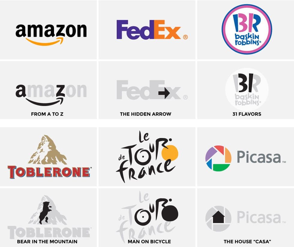
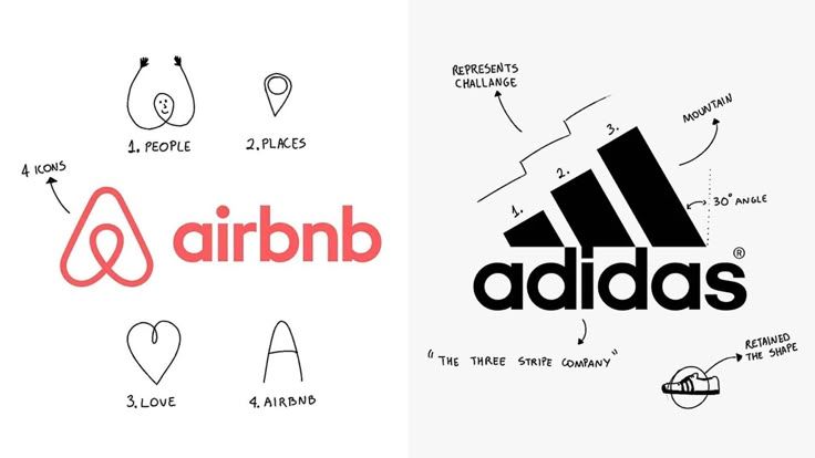
The conceptual significance of a logo can take the logo beyond its superficial aesthetics. Visual metaphors and symbols are a great way to enhance the brand’s storytelling if employed with care. But symbols should be easily accessible and not be overly abstract, as the need for clarity should always prevail over.
Designers should take into consideration:
- Context of industry
- Expectations of the target audience
- The cultural interpretations of symbols and color
- Values and brand positioning
An appropriate logo can help build trust in the brand and also helps people make accurate impressions about the business.
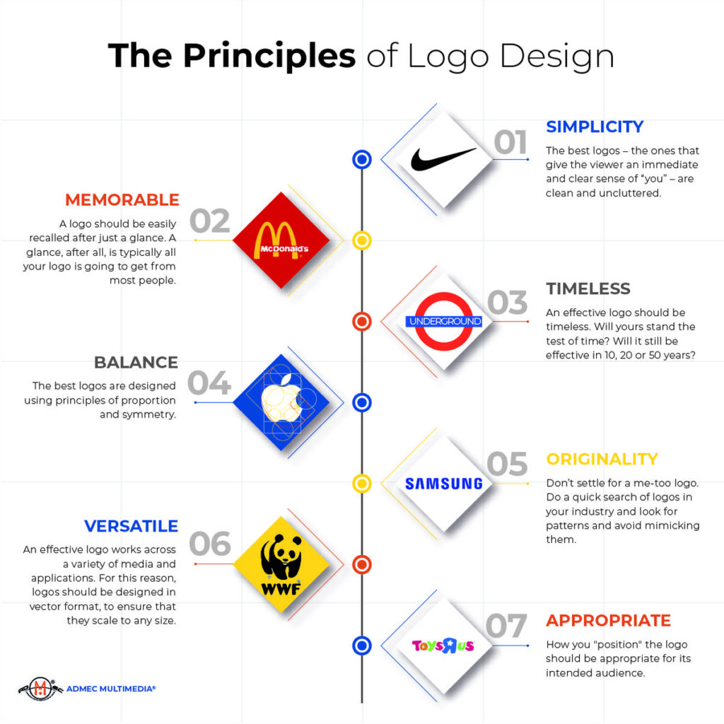
Scalability and Versatility
The term “scalability” refers to the logo’s capability to retain quality and authenticity at all dimensions. Effective logos should function similarly on a big billboard, mobile display, or even a business card. Design concepts that are based on the finer details or on thin lines are often blurred as they are scaled down.
Its versatility goes beyond size and can adapt color and format. Logos that are strong should be effective within:
- Full color
- Black and white
- Single-color application
- Dark and light backgrounds
The design process is designed with flexibility and scalability to ensure that the logo is usable for all current and future applications without needing frequent redesigns.
Typography and Letterform Integrity
Typography is a crucial element in the design of logos, regardless if the logo has text or incorporates symbols with letters. The typeface you choose to use communicates the persona and tone of the logo, which makes the choice of typeface a deliberate one rather than a style choice.
The most effective logo typography must be focused on:
- Reading ability at various dimensions
- Brand consistency
- Proportions and spacing that are balanced
- The distinctiveness of the design without overly stylization
Modified typefaces, or custom letterforms, can be used to create distinctiveness while maintaining quality and clarity. Typographic mistakes can weaken even the most solid conceptual concepts.
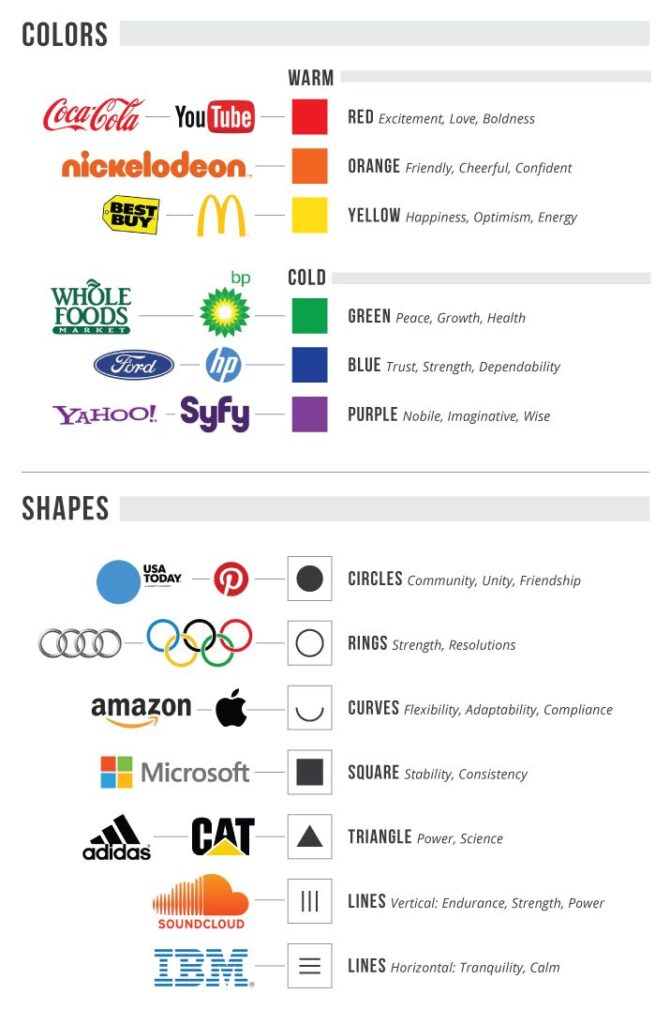
Color Usage and Visual Balance
Color has a significant impact on the perception of emotions and how they are interpreted. When designing logos, colors must be used to convey meaning and recognition instead of dominating the design. Good logos typically employ only a few colors for clarity and consistency.
Designers should take into consideration:
- Psychological connections of color
- Color and legibility
- Cultural interpretative
- Color consistency in digital and print
Visual balance makes sure that no individual element dominates the composition. An appropriate alignment, spacing, and proportion make for the appearance of a professional and steady one.
Originality and Distinctiveness
The quality of the design is crucial to distinguish yourself. A successful logo should be distinct from rivals without relying on visual cliches that are commonly used in a sector. The use of a lot of symbols or designs weakens the brand’s identity and decreases the likelihood of being remembered.
The way to distinguish yourself is by:
- Unique visual concepts
- Abstraction with thought
- Typefaces and forms that can be customized
- Clear visual hierarchy
The purpose of originality is to make sure that the uniqueness of your work enhances the communication, rather than causing confusion.
Timelessness and Longevity
The trends in graphic design evolve regularly, but logos should be able to stand the test of time. An old-fashioned logo is effective regardless of changes in style or technological advances. The designs that are too trendy could appear obsolete in just a few years, which could lead to costly revisions.
Logos that are timeless typically depend on:
- Simple form
- Proper proportions and balance
- Styles that are restrained or neutral
- Solid conceptual base
The longevity of a brand ensures continuity for the brand and increases trust and credibility throughout the course of time.
Conclusion
A successful logo results from careful rational, principle-driven design decisions rather than the mere experimentation of stylistic design. The logo should function as a communication tool, communicating the brand’s identity in a consistent manner in a variety of situations. The principles of simpleness and relevance, as well as scalability and clarity, are the basis of successful logo designs and maintain their effectiveness over time.
Prioritizing the meaning of concepts over the aesthetics, logo designers design logos that appeal to the masses and accurately reflect the brand’s values. Paying attention to typography, color and balance enhances the brand’s recognition and accessibility While originality helps ensure differentiation from other brands in the marketplace. In the same way, focus on the timeless shields the logo from demise caused by fashion trends that are short-lived.
In the end, a successful logo design is about balancing between restraint and creativity. Each decision made in design should have an objective that is communicative as well as contribute to the overall quality of the brand’s visual brand. With the help of sound design guidelines, logos are more than mere visual signs. They are permanent symbols that help build the credibility of brands, brand recognition, and a sense of cohesion throughout the years.